Kathryn essay 2: Colors

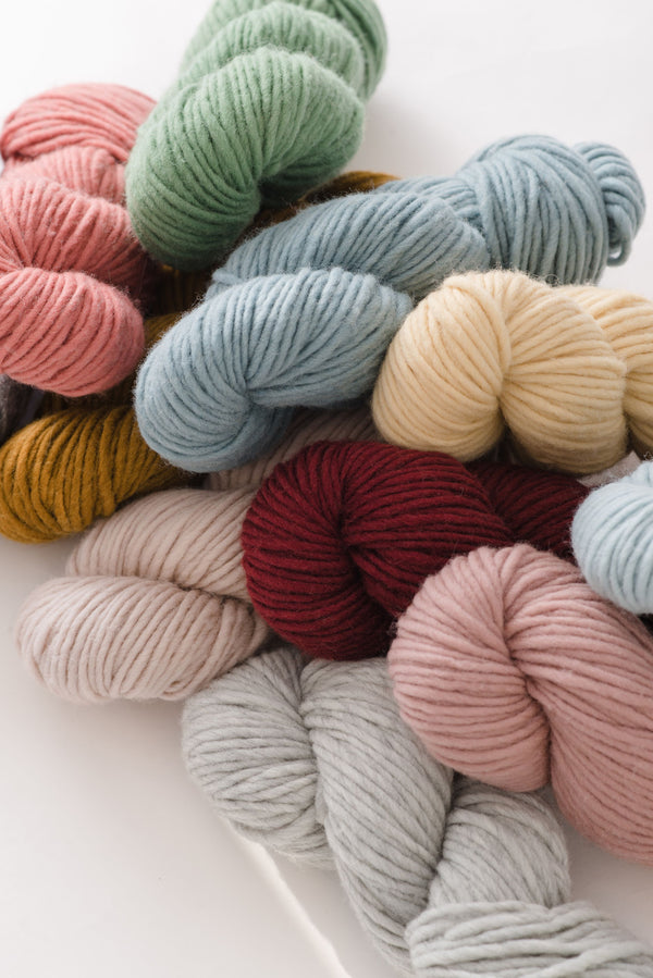
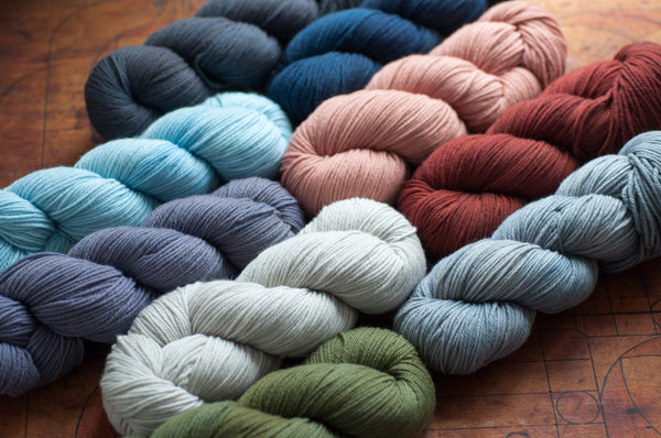
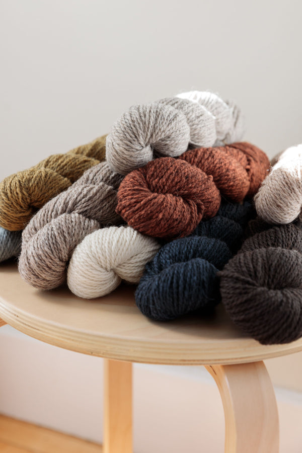
My color preferences tend toward the gradient and monochromatic, e.g. blues shading into purples, etc., and in the photos below, you really get to see that show through. One thing I learned, it's not enough just to put skeins next to each other and know how they'll play together. You have to cast on and see the stitches and rows interact in the different shades. And stripes of different widths can impact the way the colors work together.
swatch #1:

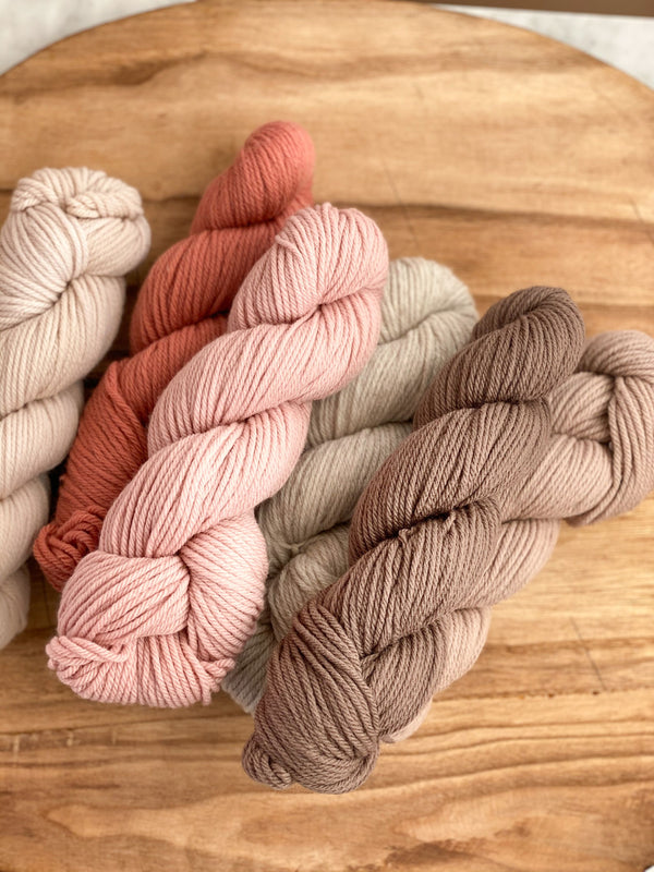
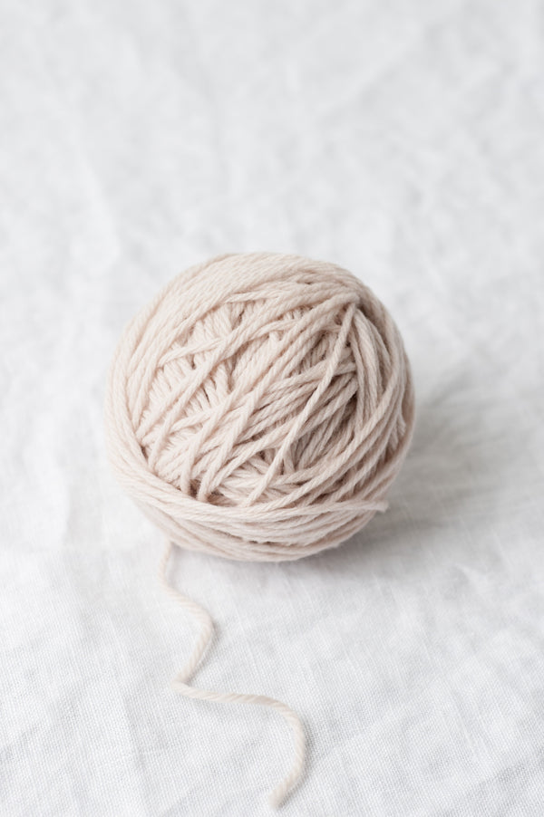
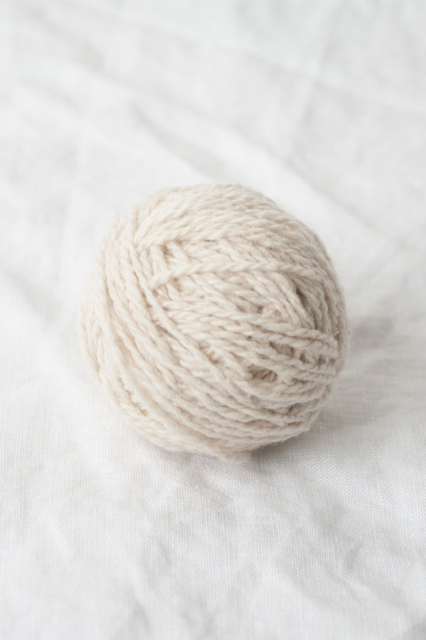
Sans (background color) is a perfect neutral—give it a little space, and you can put pretty much anything next to it without the colors looking too busy. In this swatch, I was inspired by gradient greens and blues (top to bottom: Little Fern, Fen, Blue Spruce), which are anything but overwhelming on a Sans backdrop. In this swatch, all stripes are the same width: 8 rows of each color.
swatch #2:

This combination was absolutely inspired by Neapolitan ice cream, and I'm not ashamed to say it. Sans, pink Viburnum, and brown/gray Truffle play so sweetly together, but too much pink is not my style, so I buffered it with Truffle and the wide bands of Sans balance it out nicely. Here, the Viburnum and Truffle stripes are all 4 rows wide, and for the Sans, I tried both a 6-row band and an 8-row band. Pick one, or experiment with using different widths in your striping.
swatch #3:

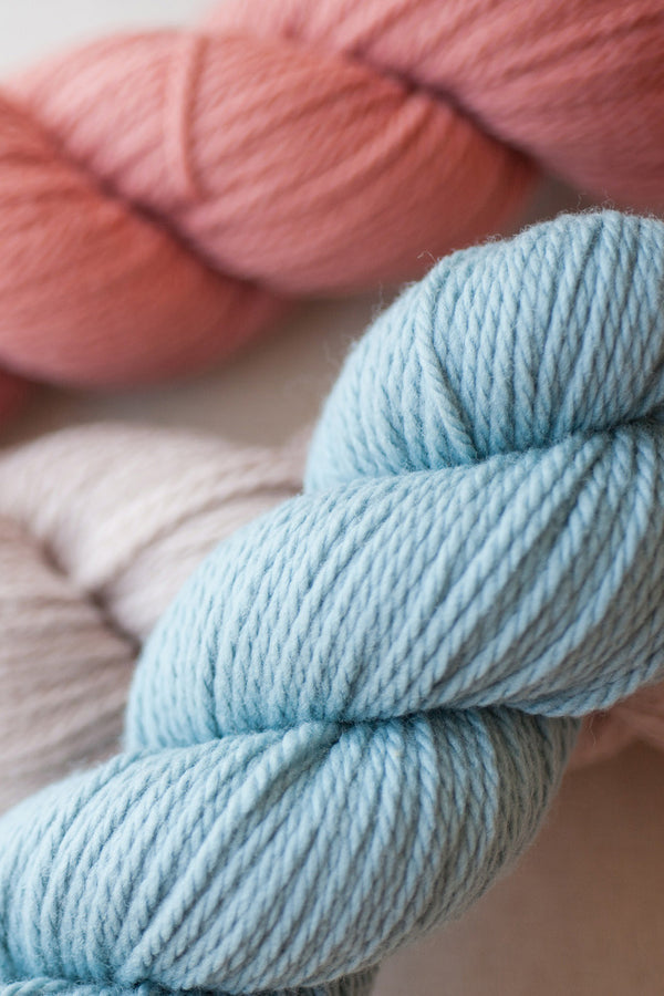
Here's my favorite and the inspiration for Kathryn—even stripes (2 rows each) of three colors that flow into each other, like sand and ocean (top to bottom: Truffle, Blue Spruce, Pigeon). Truffle is another one of those great neutrals, it can look brown, gray, or even purple (see swatch #2), depending on what you put near it. This is what happens when you don't have Sans to lighten up the palette—deep, dark, rich color.
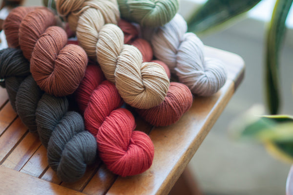
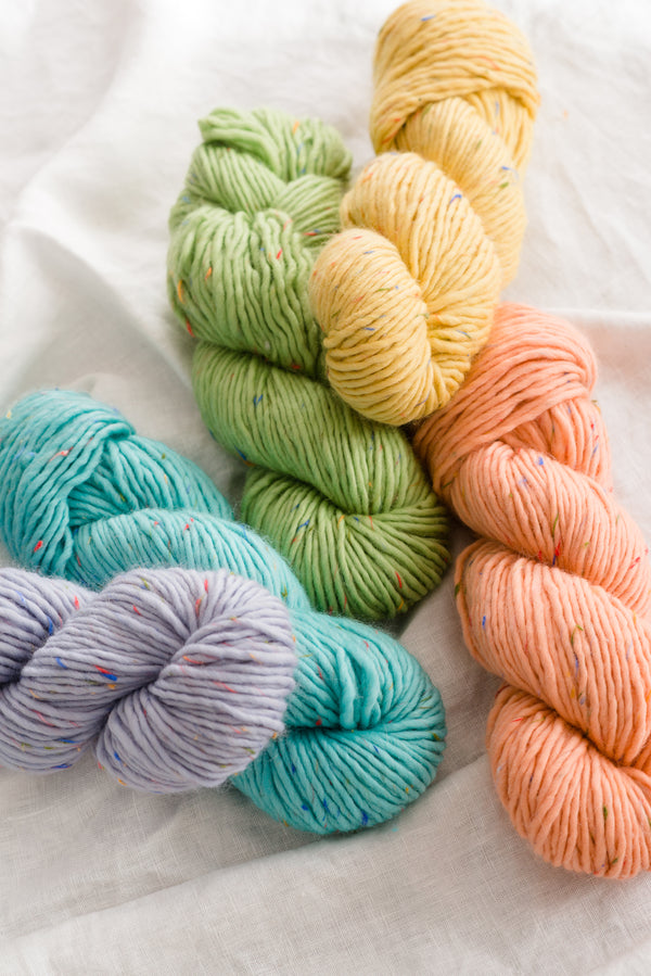
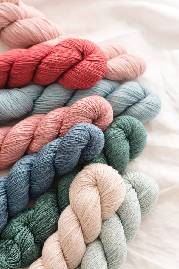
Since the sparking of this project, we've added 10 new colors to our Sparrow line, which means…so many more colors to choose from! I've taken my top three swatches and re-worked them in different palettes, but keeping the striping patterns (almost) the same:

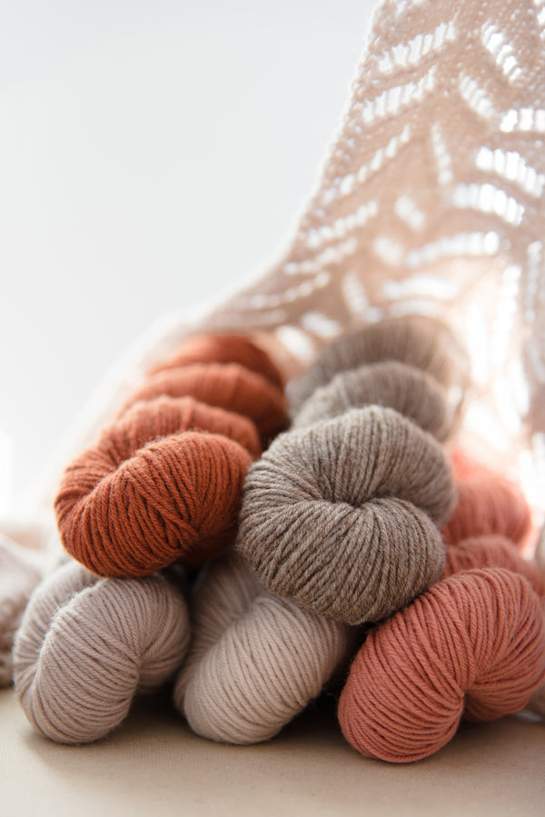
From left to right and bottom to top: Swatch 1 is Birch, Fundi, Banyon, and Hibiscus (thanks for that one Karen!!--similar to swatch #1, but obviously playing a lot more with background stripe widths); Swatch 2 is Hibiscus, Pink Grapefruit, and Moon (same stripes as swatch #3 above); Swatch 3 is Truffle, Venice, and Citron (same stripes as swatch #2 above).
Next up: See how one swatch plus one favorite tee plus one inspiration equals one new design, complete with the math (so you can do it, too!).