alternate colors for this & that

Hello Quince & Co. friends!
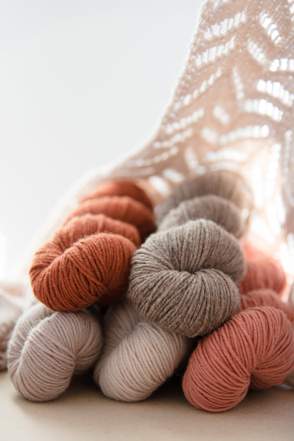
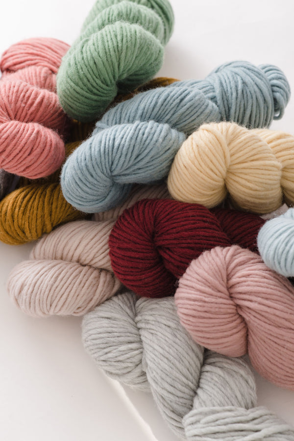
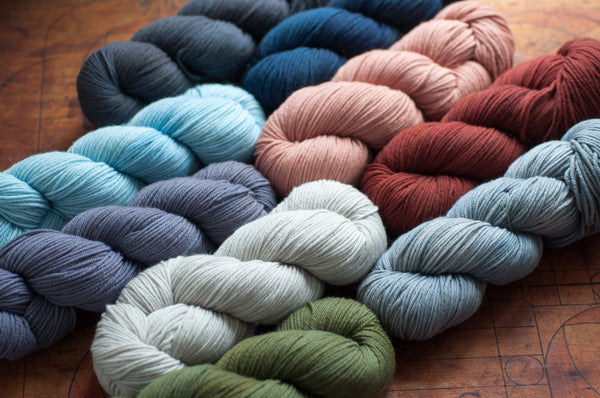
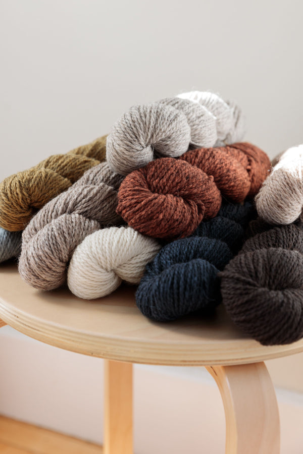
I am so excited to be writing today about one of my very favorite parts of any colorwork project: choosing colors! I know this is a task that can feel uncertain and intimidating to many. You might think you need to have a deep knowledge of color theory, or a lot of expertise, but that is not true. Anyone can put together beautiful color combinations - all you really need is a little confidence, and a willingness to experiment.
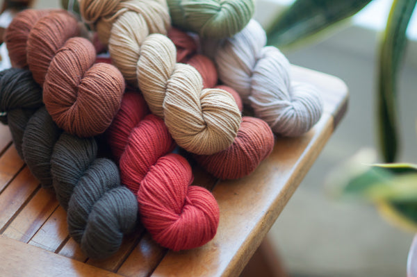
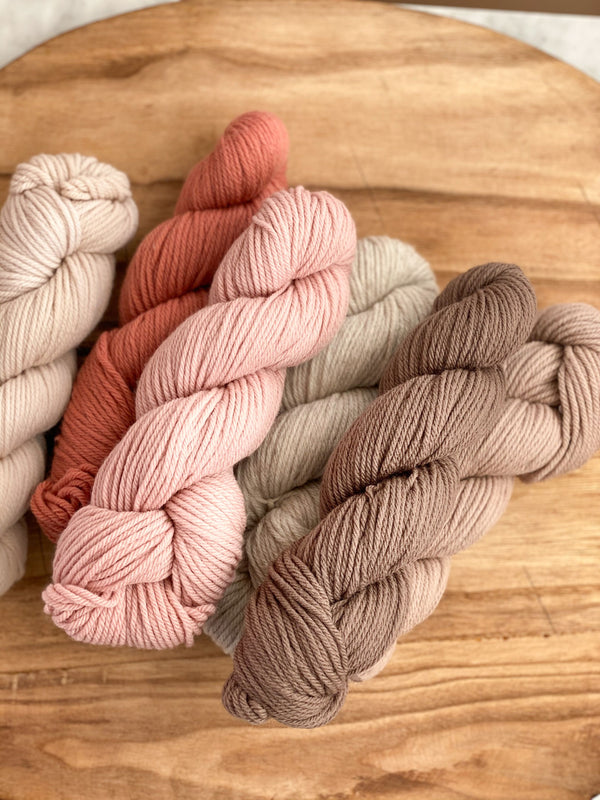
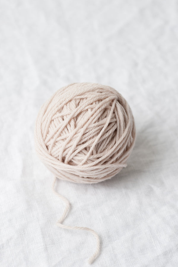
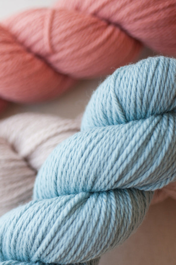
I was really inspired by Pam’s newest book, This & That, so I put together a few alternate color palettes for the sweaters within its pages. I use a couple of different techniques when choosing colors. Usually I start with a favorite shade - for me these are yellows and pinks. Then I try to find a good neutral, and a contrast color to compliment it. If the pattern requires more than three colors, I’ll then add another contrast, and another neutral that falls somewhere else on the light to dark spectrum. To make sure there is a strong enough contrast, I often take a gray-scale picture with my phone. Another technique I am fond of is to choose a monochromatic palette with one or two pops. Something like a dark and light blue with a soft yellow, or a couple shades of green with a dusty pink. The most important thing is just to trust your gut, and choose something that speaks to you.
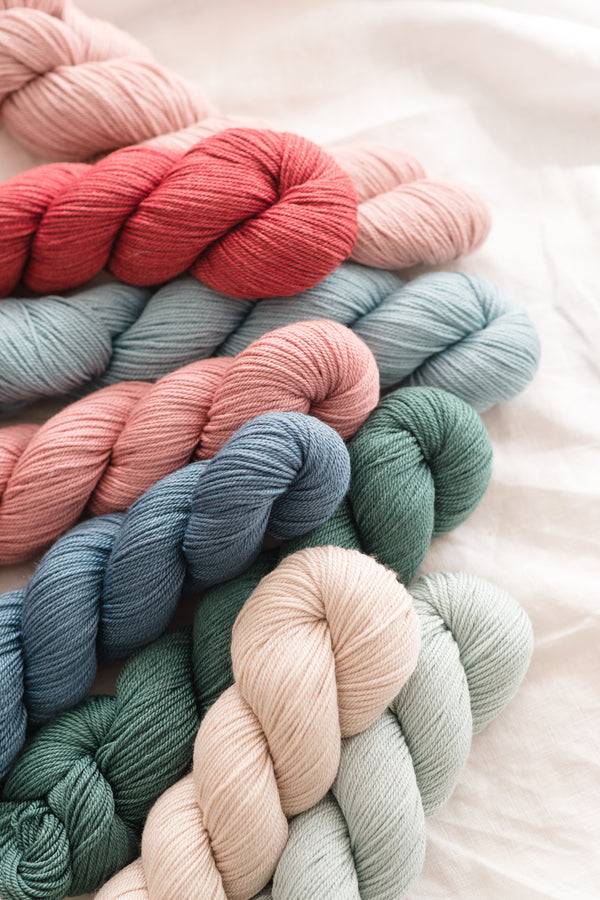
Bayberry- 6 Colors
For Bayberry, Pam chose a lovely soft main color, with more saturated contrasts. I’ve put together one palette that follows this path, but with warmer tones, and one that starts with a saturated shade and relies on neutrals for contrasts.
- MC- Tyto, CCs- Canyon, Mesa, Steppe, Lagoon, and Papuan
- MC-Chamomile or Canyon, CCs- Snowy, Abyssinian, Tawny, Huckleberry, and Cielo


Hobblebush- 5 Colors
Hobblebush uses neutrals with two contrasting colors. I’ve made two palettes that follow this format, one with a lighter MC, and one with a darker MC.
- MC-Snowy, CCs-Albertine, Papuan, Taiga, and Cranberry
- MC-Papuan, CCs-Elf, Bubo, Cinnamon, and Barents Sea


Winterberry- 3 Colors
I don't like to play favorites, but this drop shoulder sweater has been calling my name since I first saw it. I love Pam’s original choice of Barents Sea as the main color, but I’ve put together a couple other options for Winterberry. Try switching up the main and contrast colors, and seeing what suits your taste.
- MC-Elf, CCs-Cinnamon and Huckleberry
- MC-Canyon, CCs-Abyssinian and Chamomile


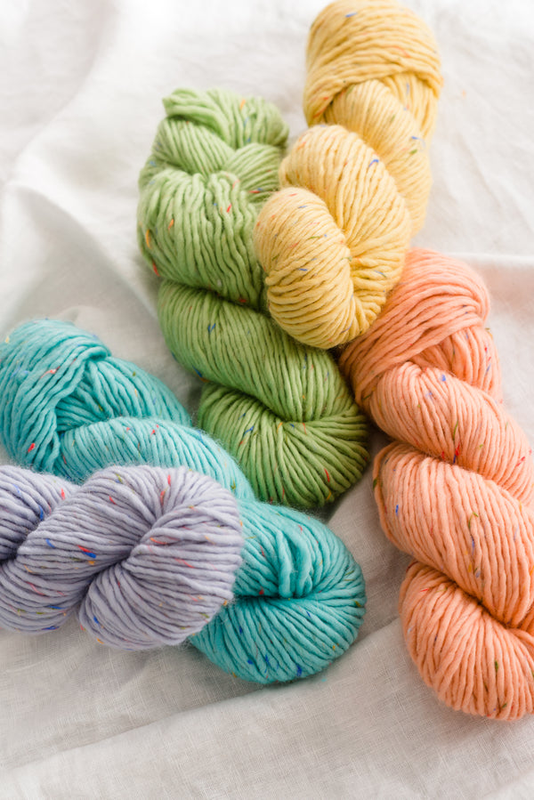
Snowberry- 5 Colors
A hat is a great way to experiment with colors on a smaller canvas. For this five-color hat, I’ve put together a couple of fun, slightly more vibrant palettes, in hopes of bringing a bit of brightness to winter. For these I haven’t designated a main color, because any of them could fit, depending on what your mood is.
- Abyssinian, Mesa, Straights, Chamomile, and Cielo
- Yucca, Canyon, Lagoon, Cerulean, and Elf

 I hope you have a lot fun making color palettes for This & That, and for any other colorwork pattern you find. Don’t forget about our website's handy "Compare Colors" tool, and make sure to stop by your LYS, where they would love to help you build a perfect palette.