introducing: lost coast
Knitting for children is considered by many to be the best kind of knitting. Fun, satisfying, playful in color, and so very quick compared to larger projects. It’s lighthearted knitting at its finest. Today we release our first collection specifically for kids: The Lost Coast Collection.
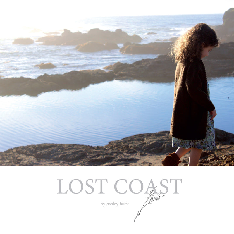
Inspired by the Lost Coast region of northern California, designer Ashely Hurst formed a collection of four sweaters (two pullovers, two cardigans), a cowl, a hat, and a blanket. The variety of yarn weights and skill levels within the patterns gives you the freedom to choose a project to suit your mood—and available time to knit. From Chickadee to Lark, Owl to Osprey, there is something for everyone. And, being sized for ages 2–10, it’s bound to fly off the needles quickly, no matter which project is chosen.
Ashley's imagery for this collection transports us to the coastline: Little ones running, climbing, exploring along the sands, peering at the rocky treasures at their feet, protected from the elements by lovingly created knits. You can practically hear the sounds of the surf, the wind in the grasses, the delighted laughter.
We wanted to introduce Ashley today with the launch of this wonderful collection—we hope you enjoy!

Let’s start off with a little background history: We first came across some of your imagery on Instagram from the photo shoot—the sweater in Tern with the pretty details on the back caught our eye and made us want to reach out to you for a potential collaboration. And here we are! What was your original vision for publishing these designs?
Yes, thank goodness for instagram! While I always had a fairly cogent vision for the pieces and the overall aesthetic of the collection, once it was finally executed, I was at a bit of a loss of what steps to take next as this is my first foray into pattern publishing. My intention was to hire an independent technical editor and then self-publish, using ravelry as a main vehicle for sales and also populating the pdf patterns in my etsy shop, relying on the embedded search engines within those sites as well as instagram for publicity. As I worked on the collection, I collaborated with a wonderful brander/web designer (http://www.sarahhigginsdesigns.com) to develop a new website specifically geared toward marketing my designs, which also has a shop component (mohrstudio.com). Depending on how the patterns were received in the community, I considered printing some hard copies as well--I am an old fashioned gal and love to hold things in my hands! I have a vision of taking Lost Coast on the road to do some trunk shows at LYSs, so stay tuned for that!
I had completed the samples and photography just before Stitches West, and figured with the amount of collective knowledge at that convention, surely I would depart with a clear game plan of how to take the next steps and bring the patterns to fruition. I met many wonderful people with great advice and industry experience to share, but honestly, I drove home feeling completely overwhelmed. Not a week into my paralysis, Ryan Fitzgerald reached out to me via instagram, waved his magic wand, and essentially offered to take care of every single loose end and make this dream of mine a reality. I refer to him still as my fairy godfather. And here we are!

There is an arresting, dream-like quality to your imagery of the region for which the collection is named—it’s easy to see the endless inspiration that can come from a place like the Lost Coast. Your Instagram feed shows that you do quite a bit of exploring, traveling, observing . . . how heavily does this influence your design process? What else informs your creative work?
Since childhood, I have always had a deep kinship with nature--being alone in the wild without a doubt is home for me. Being rather introverted, my soul is fed and restored by the vastness and the beauty and the silence. I think perhaps more than being directly informed by what I see and observe on my adventures, it is the peace and comfort imparted upon me by these experiences that allows my creativity to thrive. I do look to nature for shapes, palettes, overall aesthetics and sensations and even functionality, but these concepts are not always tangibly translated into my designs. I think it is more the state of mind I am in as a result of being so immersed in such incredible landscapes that allows me to design freely.
Additionally, a phenomenon exists wherein we are able to work through challenges and tribulations more effectively with repetitive activity, referred to sometimes as a "flow state." I have read about people entering this space both through craft and through exercise. Ironically, I find that when I am struggling with a concept related to my craft, going out for a good long run, ideally somewhere spectacular, will often resolve the issue. I always carry a notebook with me EVERYWHERE because I can never predict when that lightbulb might go off! I have found in the past few years of creating under more structured circumstances (i.e., for profit as opposed to solely for pleasure), I personally cannot force the muse. I have gotten better at tempting it, and I have habits and routines that aid me in coaxing it (pinterest, instagram, fringe association, pondering, many cups of tea, regular exercise, solitude in nature, sketching, sketching, sketching), but ultimately, my best ideas often come at unexpected times!

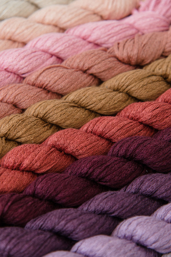
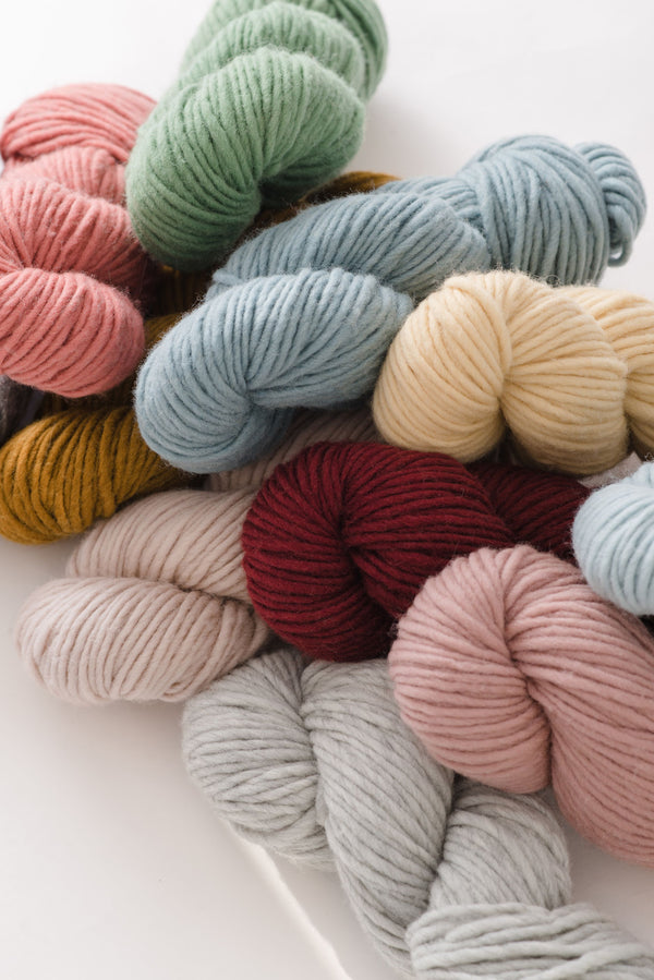
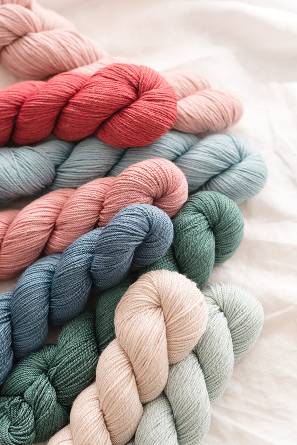
clockwise from top left: Agate, Humboldt, Shelter Cove, and Moonstone
From a knitter’s perspective, we love the variety in these projects. From Tern to Osprey, the patterns cover quite a range of different weights and fiber types. What drove your decision-making for the yarns you used in the collection?
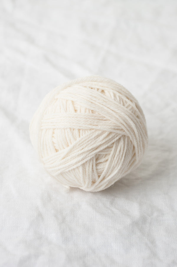
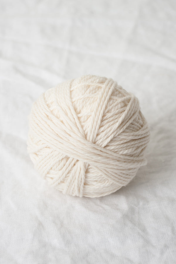
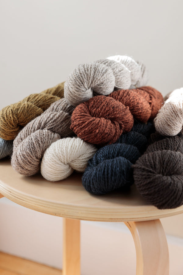
I am a longtime lover, supporter, and general brand loyalist of Quince yarns. I stumbled upon Quince shortly after I began knitting, and I rarely knit with anything else. Each of the yarns are so thoughtfully engineered and have such character, with palettes unmatched in the knitting world, in my opinion. It was a pleasure to showcase the beauty and utility they each possess--the strength and delicacy of drapey, muted Tern, the warmth and lightness of cheerful, fuzzy Owl (possibly the world's most perfect yarn?!), and Lark, the smooth and beautiful workhorse. I wanted both to show the versatility of these fibers and create a diverse collection that would be interesting to knit and valuable and functional both as individual pieces and as a whole.

The colors you chose complement the coastal atmosphere so well; did you work with an intentional palette or did it just come together naturally?
Choosing the palette is one of my absolute favorite parts of the design process. Like the beginning of a new relationship, everything is exciting and full of promise! It is the most delightful puzzle to see how different colors work with each other, how different fibers take up the dye, how well they will compliment certain design elements, and how nicely they all play together. I gravitate toward more neutral, muted colors in general and have decent familiarity with the Quince palette, so I chose the colors for this collection, with two tiny helpers, in the space of a single morning. I had actually never visited the area I planned to photograph the samples, but I knew I wanted a wild, coastal setting. Early last fall, just as I was beginning to sketch the collection, Sunset Magazine had a spread on the Lost Coast, and I was sold. It looked and felt totally right to me. Armed with some knowledge of the northern California coastline and feeling a deep connection to it, I felt confident the muted palette would blend well with the mystical, ethereal aesthetic of the area. Working with this palette was a joy each day, and seeing the finished pieces set in the landscape was incredibly rewarding--it definitely all came together better than I could have planned it!

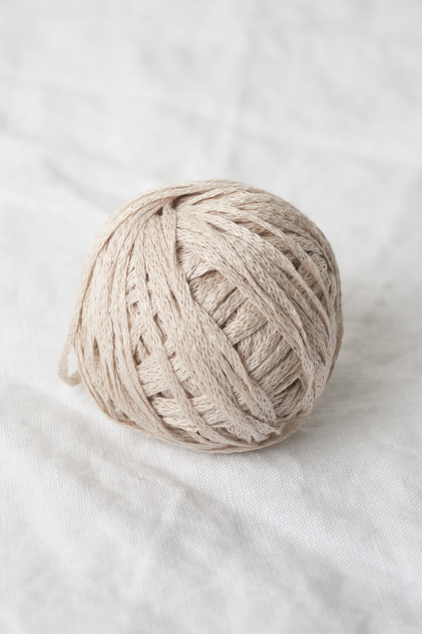
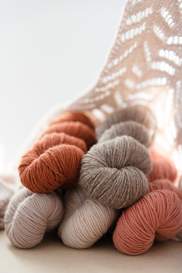
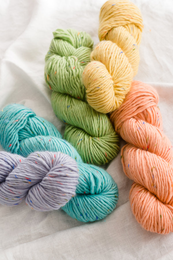
Foliose in Osprey
Ashley, thank you so much for joining us today! We hope this was an informative read. There was so much to talk about that we decided to have her come back next week with some further insights about the collection—stay tuned!
A Note On Owl Substitutions
Speaking of color, we wanted to share some alternate color choices for those of you who were hoping to work with some of our Owl colors that may not be currently available (never fear, they will be flying back to us soon!).

from left to right: Owl in Elf, Cement, Tawny, Sokoke, and Cielo; Owl Tweet in Otus, Allagash, Oak, and Buffalo Plaid
The Trinidad cowl is photographed in Tyto, a light neutral; try Elf for an ever so slightly lighter, cooler tone. Or go the other way with Tawny, if warm tones are more to your liking.
For the Moonstone pullover, the combination of stripes can be taken in so many directions it can be hard to choose! Photographed in a subtly-toned pair of neutrals, the sweater can also go bold, using a deep shade contrasted by a lighter one. Stay in neutral territory or pair two equally bold, saturated colors. Further options are made possible by combining Owl Tweet with Owl—the yarns are identical in weight and gauge. Their difference lies in the tweediness of Owl Tweet due to its wooly nubs. We had fun placing skeins side by side for this exercise; it was almost impossible to pair two colors that did not complement each other. Here are a few combinations we especially loved (and noted for our own projects) with different hue, value and contrast pairings:
Bold contrasts: Buffalo Plaid and Cement; Allagash and Oak; Otus and Buffalo Plaid
Light and subtle: Cielo and Elf; Elf and Cement; Cielo and Tawny
Contrasted neutrals: Elf and Otus; Oak and Tawny; Cielo and Otus
And the list doesn’t stop there. Head on over to Owl and Owl Tweet’s pages and play with combining up to six colors at a time using the “compare colors” feature (you’ll find this just below the main yarn image).
Have fun with it! As always, we caution that monitors may display colors differently than they appear in real life, and can vary from display to display (no matter how carefully we attempt to get as close to true colors as possible). When in doubt, ordering a color card is highly recommended so you can see the yarn in person and make decisions from there—not that it necessarily makes it any easier to narrow down your favorites!